Onboarding
1. Onboarding là gì?
Onboarding là quá trình giúp người dùng mới làm quen và sử dụng ứng dụng một cách dễ dàng. Nó cung cấp hướng dẫn và thông tin về giá trị, tính năng, lợi ích của ứng dụng, giúp người dùng trở nên tự tin và sẵn sàng sử dụng app một cách hiệu quả.
2. Tại sao nên có onboarding?
Onboarding đóng vai trò quan trọng trong việc xây dựng trải nghiệm người dùng và sự thành công của một ứng dụng. Lý do nên có onboarding:
- Giảm rào cản: Bằng cách cung cấp hướng dẫn và hỗ trợ chi tiết, nó giúp người dùng vượt qua các khó khăn ban đầu và nhanh chóng làm quen với ứng dụng.
- Tăng sự hiểu biết: Onboarding cung cấp cho người dùng thông tin chi tiết về tính năng, chức năng và lợi ích của ứng dụng. Nó giúp người dùng có trải nghiệm tốt hơn và nhanh chóng đạt được mục tiêu của mình.
- Tạo trải nghiệm tích cực: Nó giúp người dùng cảm thấy hài lòng và tự tin khi sử dụng ứng dụng, tạo ra một ấn tượng tốt về sản phẩm và tăng khả năng tiếp tục sử dụng ứng dụng trong tương lai.
3. Phân loại và cách dùng
Hiện tại Zalo Mini App đang cung cấp 2 template như sau:
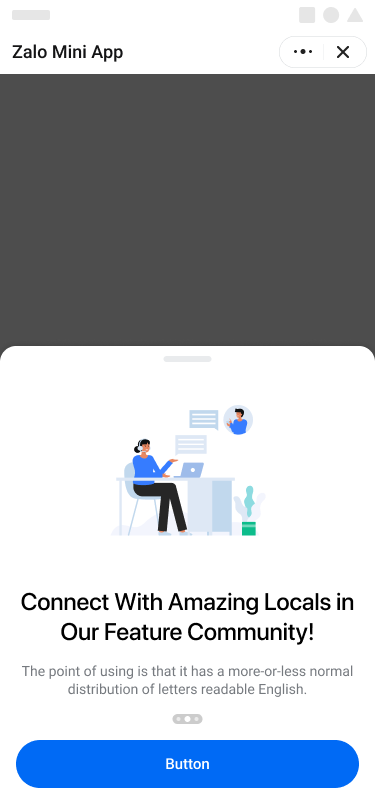
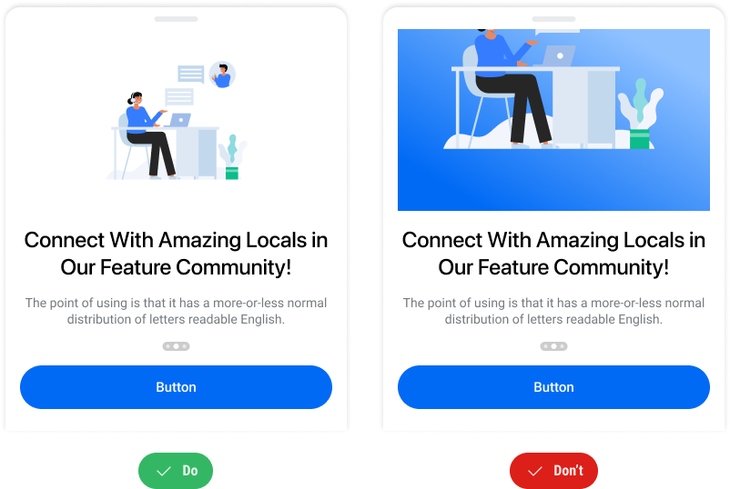
Template multi-step thường dùng để giới thiệu tính năng, dịch vụ nổi bật của Mini App với user bằng nhiều bước khác nhau
- Ưu điểm: Mini App có nhiều không gian để hiển thị thông tin chi tiết cho từng tính năng, dịch vụ
- Nhược điểm: Người dùng có thể bỏ qua những tính năng, dịch vụ tại các bước phía sau
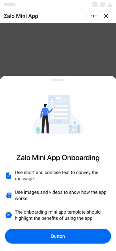
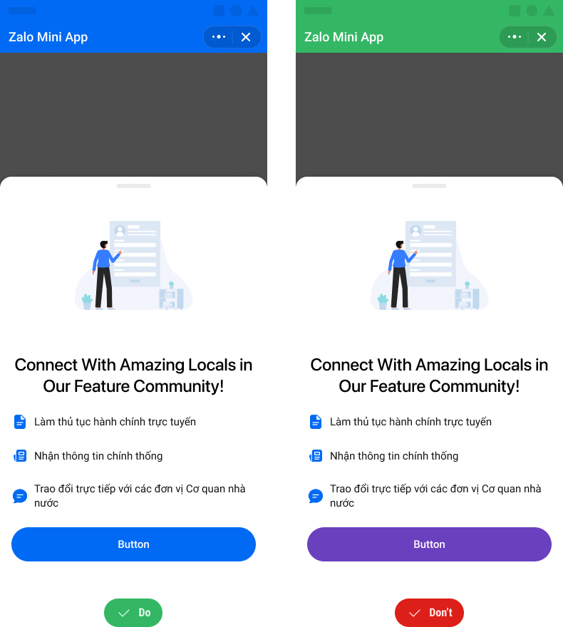
Template single screen thường dùng để giới thiệu về các tính năng, dịch vụ nổi bật của Mini App với user bằng screen duy nhất
- Ưu điểm: Mini App có thể hiển thị đồng thời được nhiều tính năng, dịch vụ nổi bật
- Nhược điểm: Mini App ít không gian để hiện thị chi tiết cho từng tính năng, dịch vụ
4. Cấu tạo component
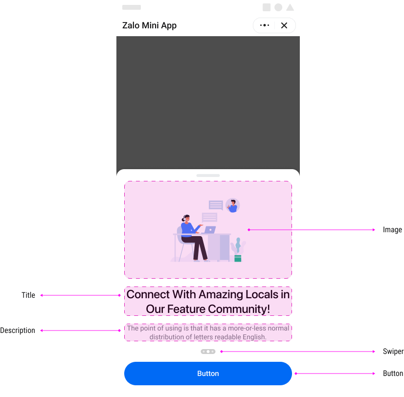
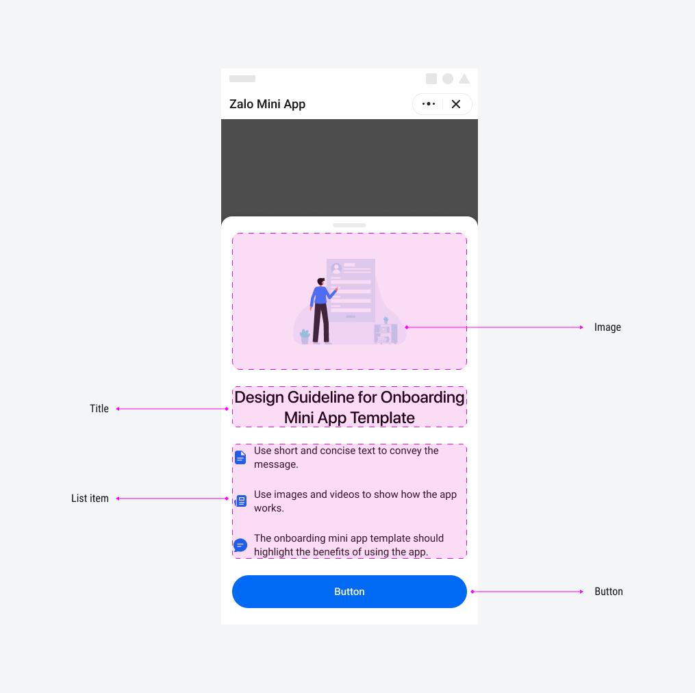
Template được xây dựng từ component bottom-sheet của Mini App Platform. Xem thêm tại đây
- Image
- Title
- Description
- Swiper
- Button
- Image
- Title
- List item
- Button
5. Design và content
5.1 Design
Nhằm giúp người dùng có một trải nghiệm tốt nhất, thiết kế của onboarding flow nên:
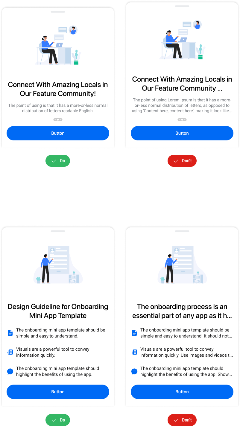
- Sử dụng hình ảnh có nền trắng & trong suốt.
- Hình vẽ phải được hiển thị trọn vẹn và không để viền cắt ảnh
- Style vẽ đơn giản không có quá nhiều chi tiết và hạn chế nội dung trong ảnh.
- Màu sắc chính của hình ảnh, button nên sử dụng màu primary của Mini App
- Sử dụng hình ảnh có nền trắng & trong suốt.
- Hình vẽ phải được hiển thị trọn vẹn và không để viền cắt ảnh
- Style vẽ đơn giản không có quá nhiều chi tiết và hạn chế nội dung trong ảnh.
- Màu sắc chính của hình ảnh, button nên sử dụng màu primary của Mini App
5.2 Content
Để tối ưu hoá nội dung, phù hợp với hành vi Scan and Skim của đa số người dùng, nội dung Onboarding có thể chọn 1 trong 2 dạng chính sau:
- App non-goverment
- App goverment
- Tiêu đề và mô tả tối đa 2 dòng, không “...”
- Nội dung tiêu đề, mô tả ngắn gọn súc tích, trọng tâm
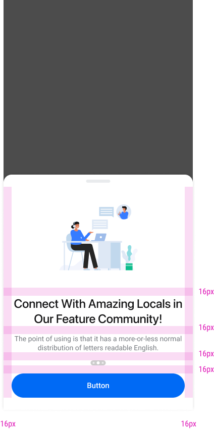
6. Cấu trúc & thông số
7. Code demo
Multi-Step Onboarding
import React, { useState, useRef } from "react";
import { Page, Swiper, Box, Button, Text, Sheet } from "zmp-ui";
import styled from "styled-components";

const LAST_STEP_INDEX = 2;

const ImageWrapper = styled.div`
  width: 100%;
  img {
    width: 100%;
    height: auto;
  }
`;

const SlideContent = styled.div`
  width: 100%;
  padding-bottom: 2rem;
  overflow: hidden;
`;

const StyledTitle = styled(Text.Title)`
  text-align: center;
  width: 100%;
  white-space: initial;
`;

const TextDescription = styled(Text)`
  color: #767a7f;
  white-space: initial;
  text-align: center;
  width: 100%;
  margin-top: 1rem;
`;

export default function MultiStepOnboarding() {
  const [visible, setVisible] = useState(true);
  const [isLastStep, setIsLastStep] = useState(false);
  const swiperRef = useRef(null);

  const handleActionClick = () => {
    const swiper = swiperRef.current;
    if (swiper) {
      if (swiper.activeIndex === LAST_STEP_INDEX) {
        setVisible(false);
        return;
      }
      swiper.next();
    }
  };

  return (
    <Page>
      <Box p={4}>
        <Box p={4} className='section-container'>
          <Text> Welcome to Zalo Mini App</Text>
        </Box>
      </Box>
      <Sheet visible={visible}>
        <Box p={4}>
          <Swiper
            ref={swiperRef}
            afterChange={(currentIndex) => {
              setIsLastStep(currentIndex === LAST_STEP_INDEX);
            }}
          >
            <Swiper.Slide>
              <SlideContent>
                <ImageWrapper>
                  <img
                    alt='sample'
                    style={{ width: "100%", height: "auto" }}
                    src='https://stc-zmp.zadn.vn/zaui/images/sample-img-01.png'
                  />
                </ImageWrapper>

                <StyledTitle>
                  Connect With Amazing Locals in Our Feature Community!
                </StyledTitle>
                <TextDescription>
                  The point of using is that it has a more-or-less normal
                  distribution of letters readable English.
                </TextDescription>
              </SlideContent>
            </Swiper.Slide>
            <Swiper.Slide>
              <SlideContent>
                <ImageWrapper>
                  <img
                    alt='sample'
                    style={{ width: "100%", height: "auto" }}
                    src='https://stc-zmp.zadn.vn/zaui/images/sample-img-02.png'
                  />
                </ImageWrapper>

                <StyledTitle size='large'>
                  Connect With Amazing Locals in Our Feature Community!
                </StyledTitle>
                <TextDescription>
                  The point of using is that it has a more-or-less normal
                  distribution of letters readable English.
                </TextDescription>
              </SlideContent>
            </Swiper.Slide>
            <Swiper.Slide>
              <SlideContent>
                <ImageWrapper>
                  <img
                    alt='sample'
                    style={{ width: "100%", height: "auto" }}
                    src='https://stc-zmp.zadn.vn/zaui/images/sample-img-03.png'
                  />
                </ImageWrapper>

                <StyledTitle>
                  Connect With Amazing Locals in Our Feature Community!
                </StyledTitle>
                <TextDescription size='small'>
                  The point of using is that it has a more-or-less normal
                  distribution of letters readable English.
                </TextDescription>
              </SlideContent>
            </Swiper.Slide>
          </Swiper>
          <Button onClick={handleActionClick} fullWidth>
            {isLastStep ? "Close" : "Next"}
          </Button>
        </Box>
      </Sheet>
    </Page>
  );
}
Single Screen Onboarding
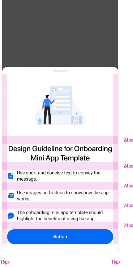
import React, { useState } from "react";
import { Page, Box, Button, Text, Sheet, List, Icon } from "zmp-ui";
import styled from "styled-components";

const ImageWrapper = styled.div`
  width: 100%;
  img {
    width: 100%;
    height: auto;
  }
`;

const StyledTitle = styled(Text.Title)`
  text-align: center;
  width: 100%;
  white-space: initial;
`;

const StyledList = styled(List)`
  .zaui-list-item {
    padding: 0;
    margin-bottom: 24px;
  }
  .zaui-list-item-prefix {
    color: #006af5;
  }
  .zaui-list-item-content {
    margin-bottom: 0;
    font-weight: 400;
    font-size: 15px;
    line-height: 20px;
  }
`;

export default function SingleScreenOnboarding() {
  const [visible, setVisible] = useState(true);

  const handleActionClick = () => {
    setVisible(false);
  };

  return (
    <Page>
      <Box p={4}>
        <Box p={4} className='section-container'>
          <Text> Welcome to Zalo Mini App</Text>
        </Box>
      </Box>
      <Sheet visible={visible}>
        <Box p={4}>
          <ImageWrapper>
            <img
              alt='sample-image'
              src='https://stc-zmp.zadn.vn/zaui/images/sample-img-04.png'
            />
          </ImageWrapper>
          <StyledTitle>Zalo Mini App Onboarding</StyledTitle>
          <Box mt={6}>
            <StyledList divider={false}>
              <StyledList.Item prefix={<Icon icon='zi-note' />}>
                Use short and concise text to convey the message.
              </StyledList.Item>
              <StyledList.Item prefix={<Icon icon='zi-photo-solid' />}>
                Use images and videos to show how the app works.
              </StyledList.Item>

              <StyledList.Item prefix={<Icon icon='zi-chat-solid' />}>
                The onboarding mini app template should highlight the benefits
                of using the app.
              </StyledList.Item>
            </StyledList>
          </Box>

          <Button onClick={handleActionClick} fullWidth>
            Button
          </Button>
        </Box>
      </Sheet>
    </Page>
  );
}
