guidelines
Button
Button thể hiện hành động mà user có thể thực hiện trên UI.
Anatomy
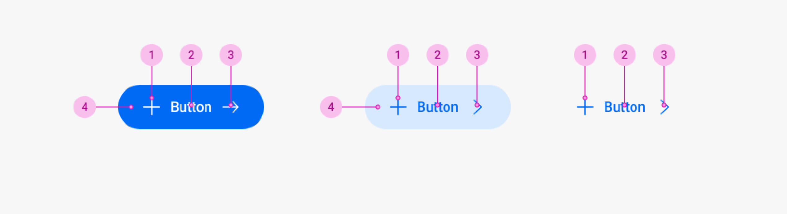
| Element | Description |
|---|---|
| 1. Leading Icon | Optional |
| 2. Text | Optional |
| 3. Trailing Icon | Optional |
| 4. Container | Optional |
Types
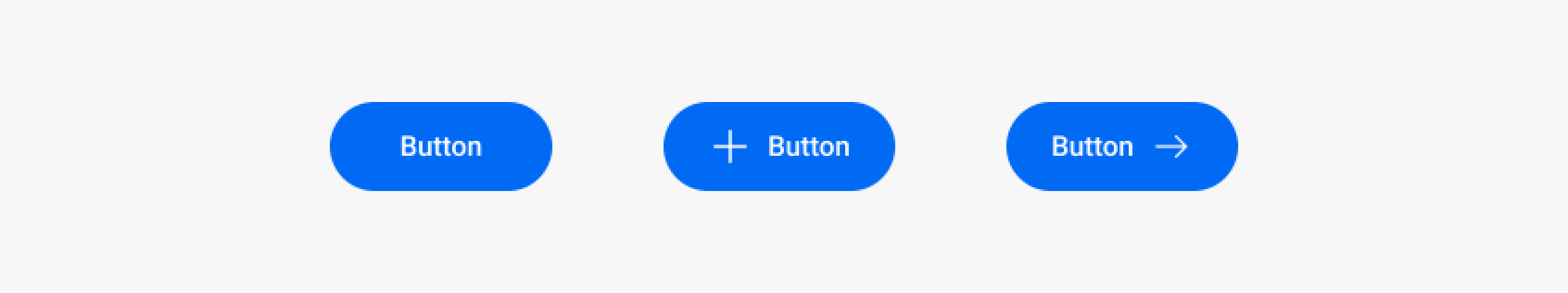
Label Button
Button thể hiện hành động mà user có thể thực hiện trên UI.
Icon Button
Loại button chỉ chứa icon.
Properties
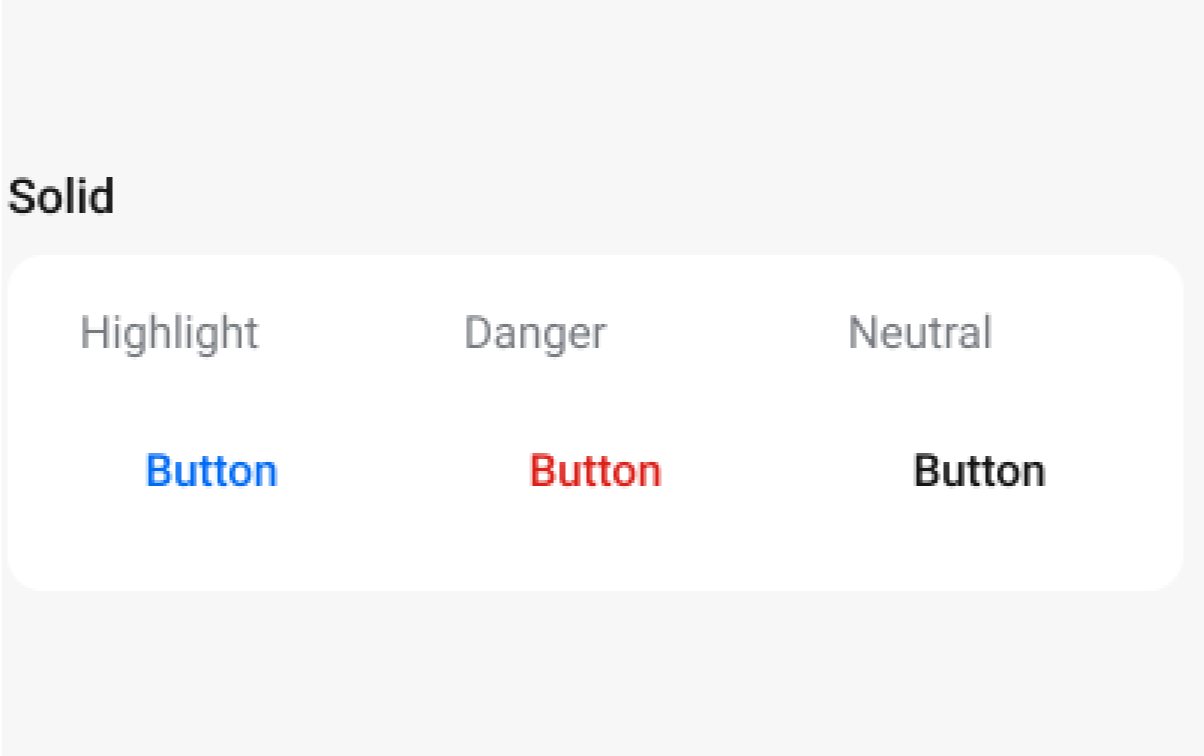
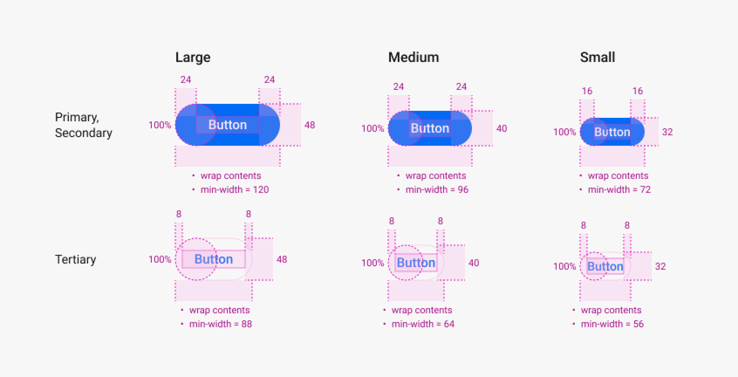
Levels
Button gồm 3 levels: Primary, Secondary, Tertiary
Primary Button
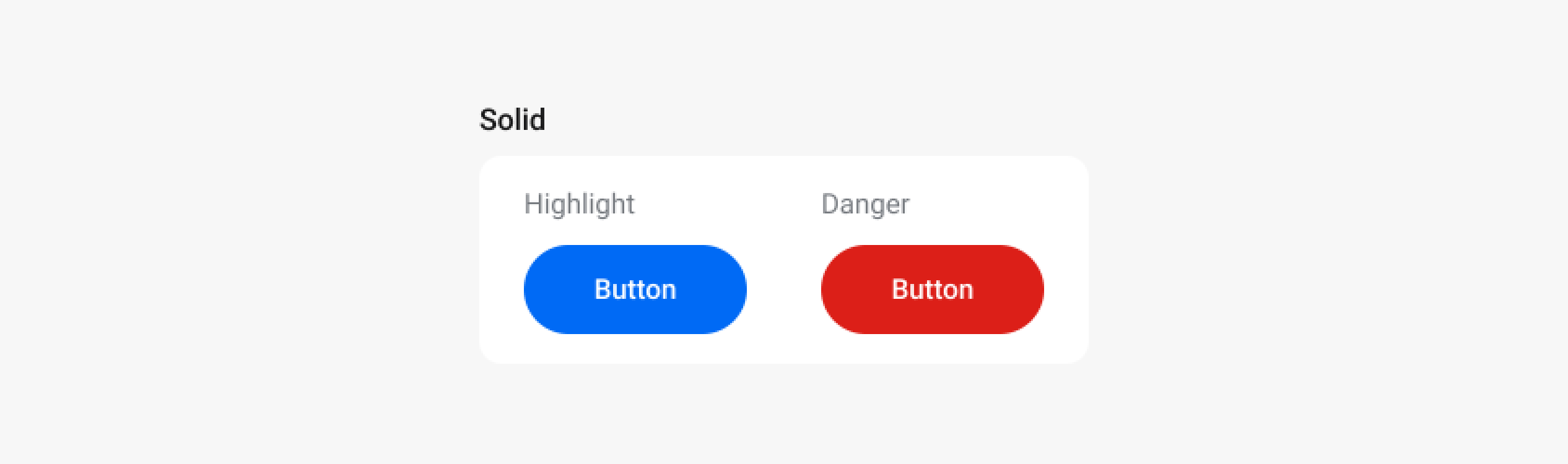
Secondary Button
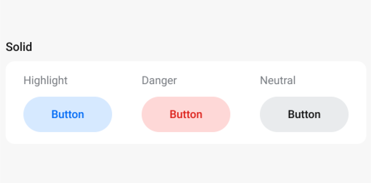
Tertiary Button
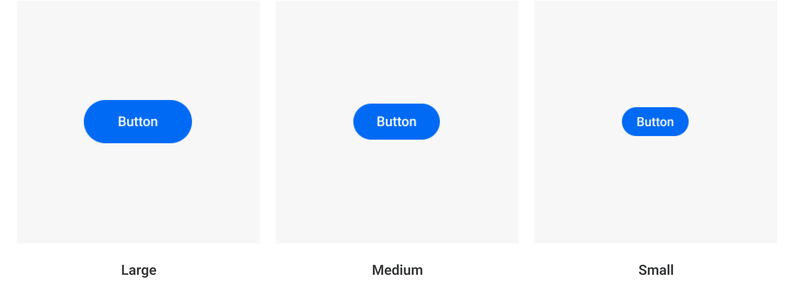
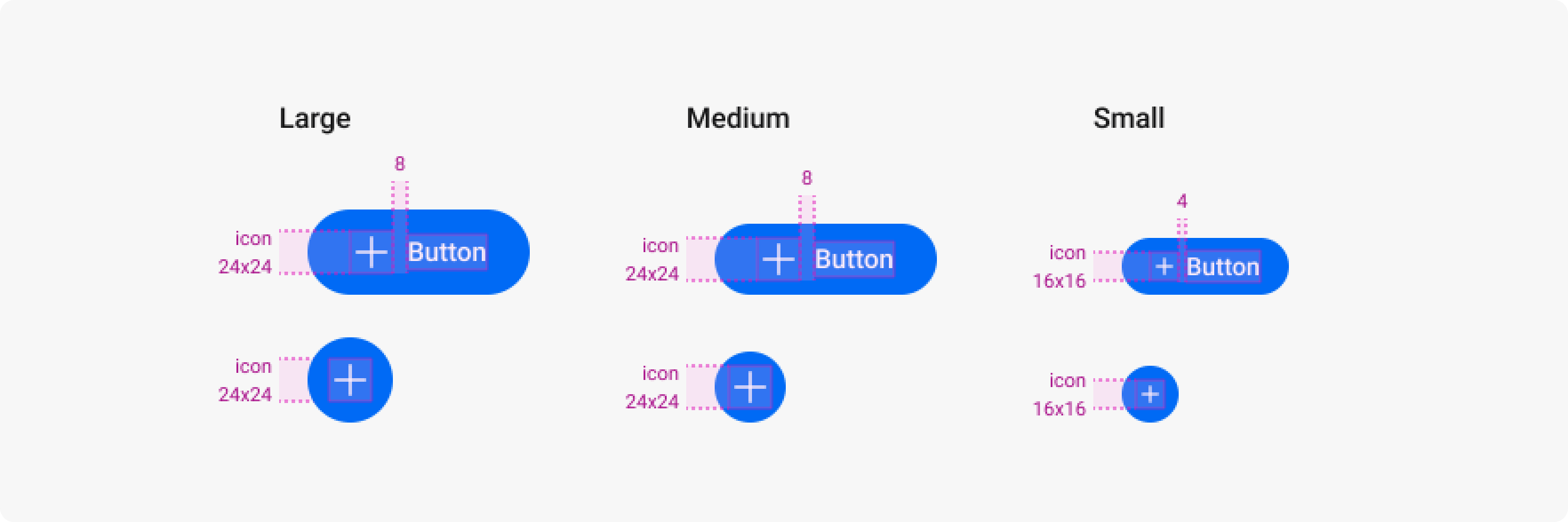
Sizes
Button gồm 3 sizes: Large, Medium, Small
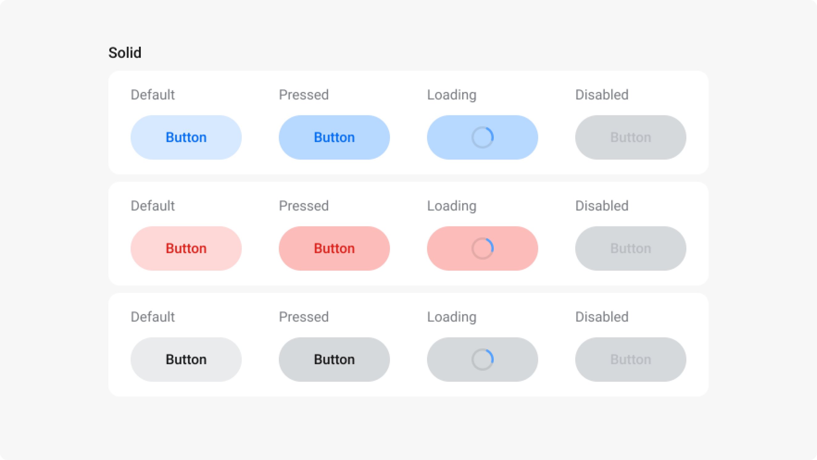
States
Button gồm 3 states:
- Pressed: Thể hiện trạng thái khi user nhấn giữ button
- Loading: Thể hiện trạng thái đang thực hiện hành động
- Disabled: Thể hiện trạng thái button không khả dụng tại thời điểm user đang sử dụng
Primary Button
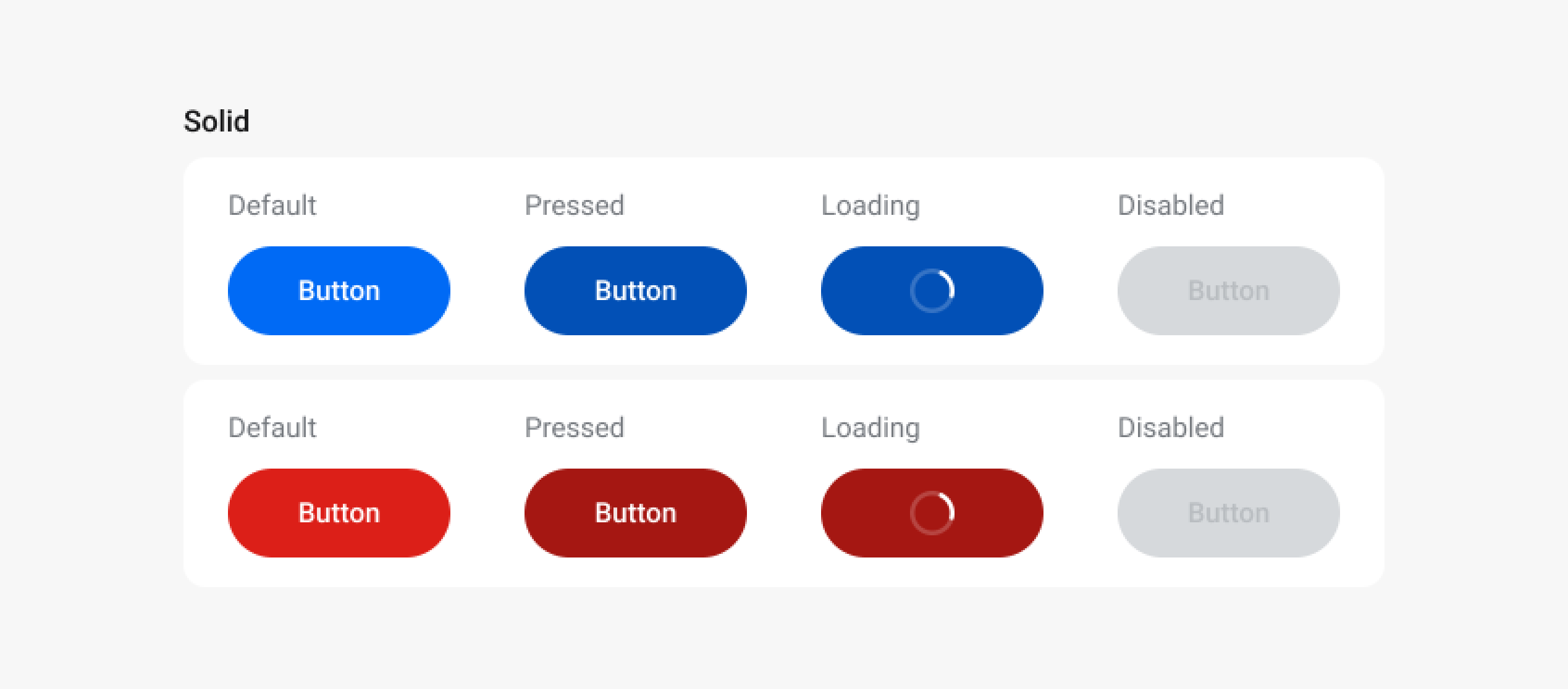
Secondary Button
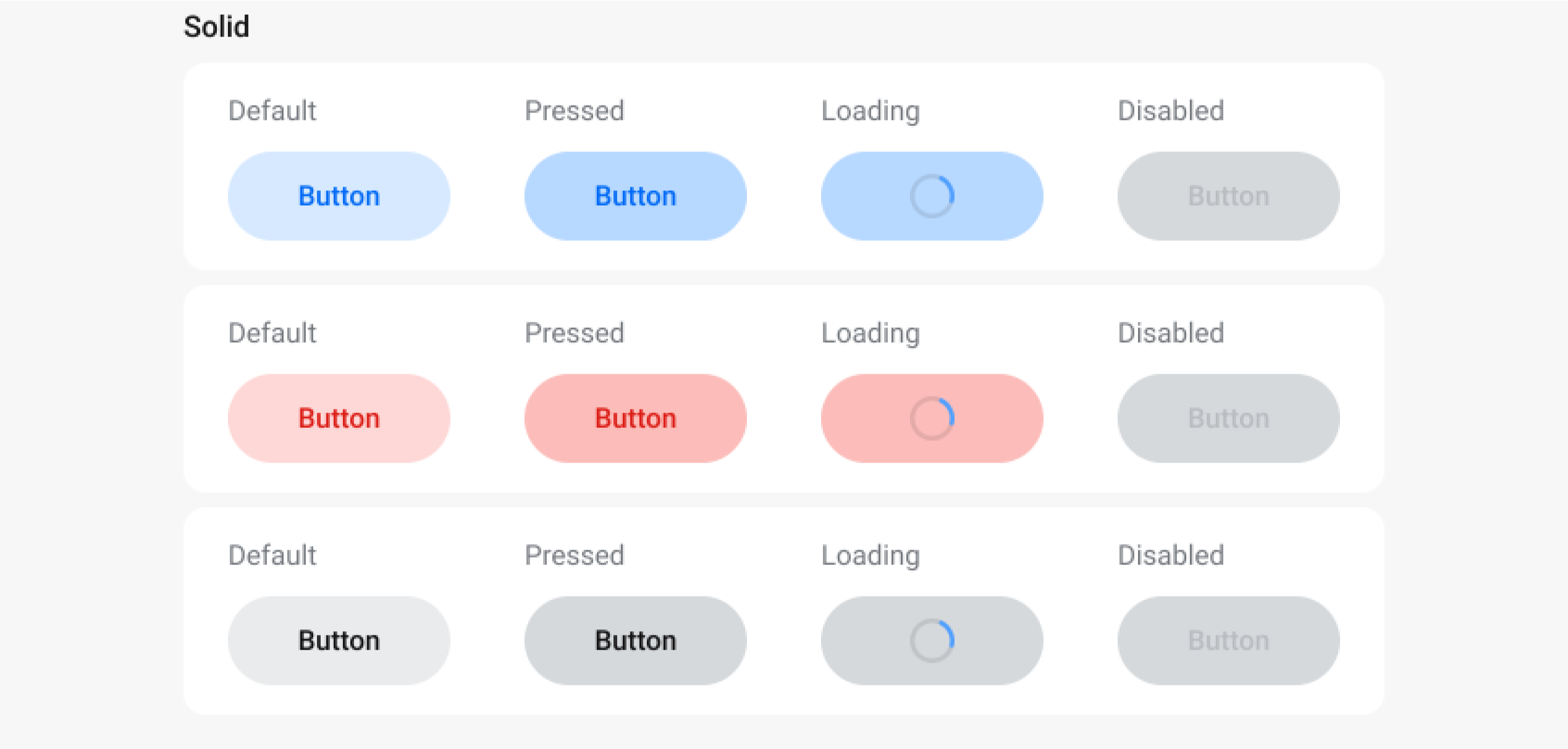
Tertiary Button
Usage
General Usage
LABEL BUTTON
Button chứa text và có thể đi kèm icon, thường được sử dụng cho:
- Action mang tính chất confirmation
- Action có mức độ quan trọng cao
ICON BUTTON
Button chỉ chứa icon, thường được sử dụng cho:
- Action mang tính chất bổ trợ
- Action kém quan trọng hơn
Sizes
LARGE
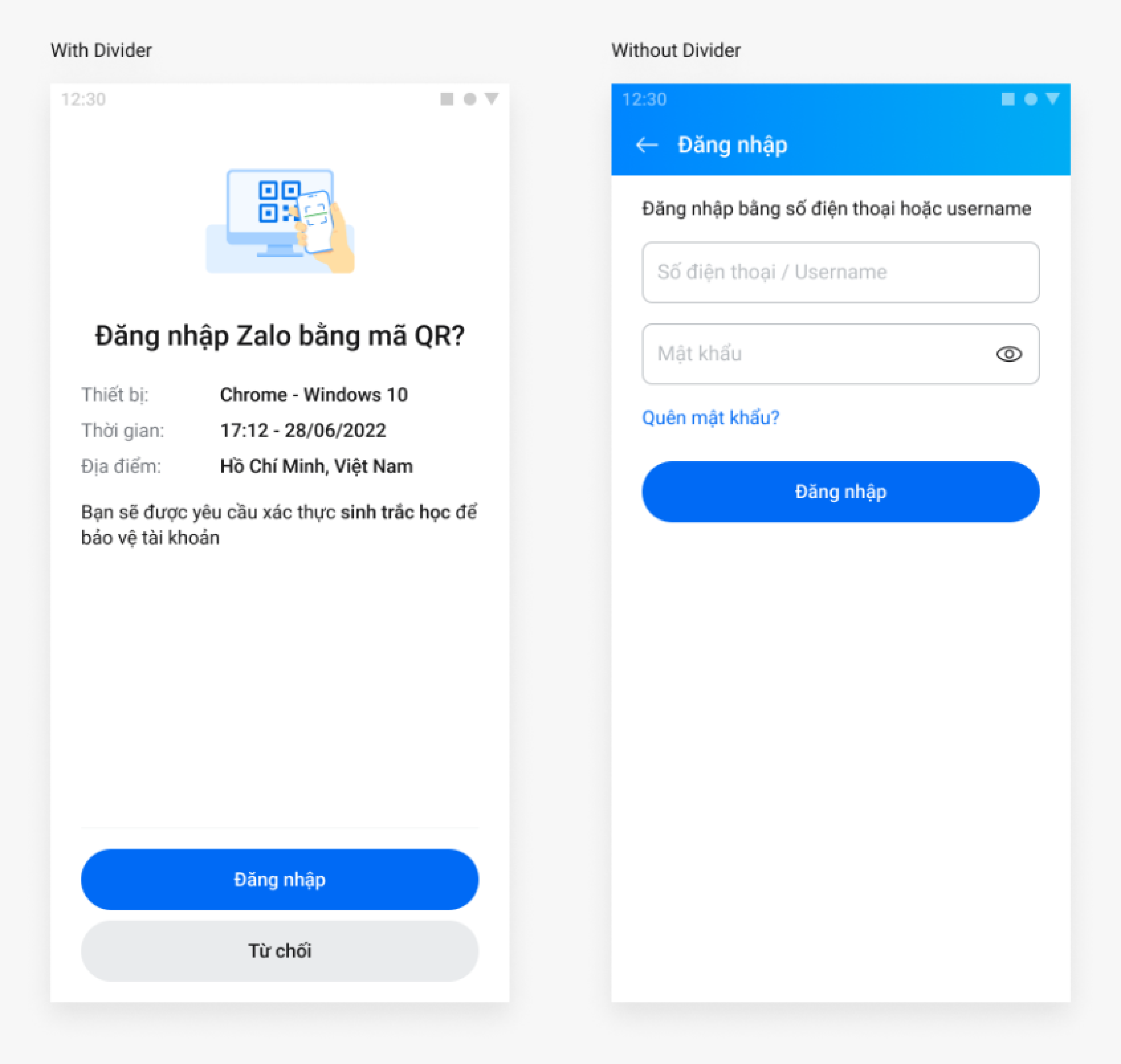
Sử dụng Large size cho trường hợp Button nằm trên một page
Sử dụng thêm divider khi Button dock to bottom of the screen
SMALL
Sử dụng Small size cho trường hợp Button nằm trong một section nhỏ hoặc một UI element có kích thước nhỏ
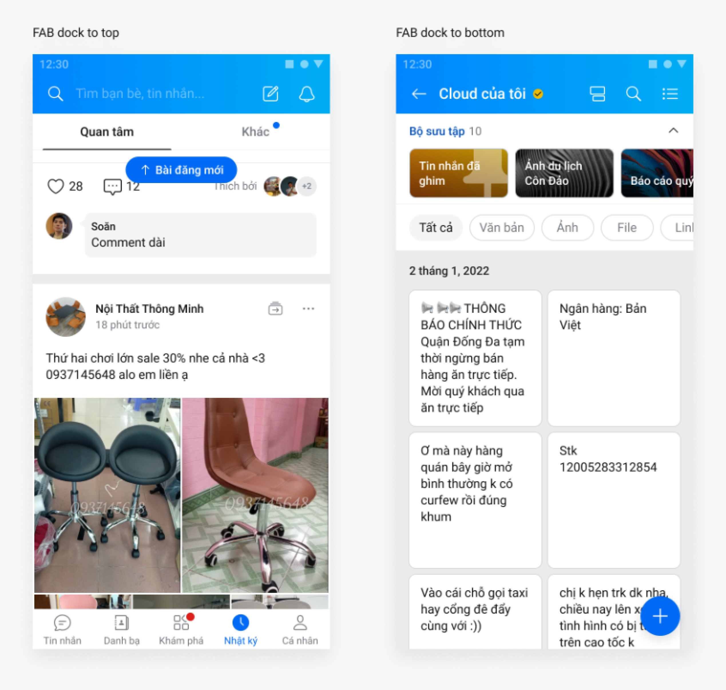
Floating Action Button
Button được sử dụng nằm floating trên UI, thường được dock to top or bottom of the screen.
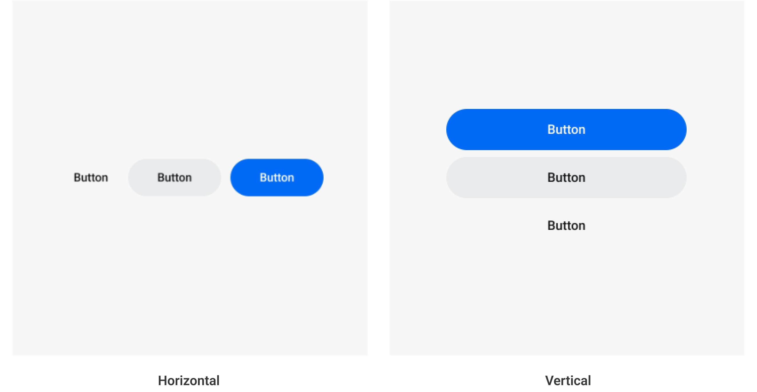
Button Group
Button Group là một nhóm các Button đi chung với nhau
- Chỉ có một Primary Button trong một Button Group
- Đảm bảo độ tương phản về mức độ quan trọng giữa các Button
DIRECTION
Button Group gồm 2 hướng:
- Horizontal: Primary Button luôn nằm bên phải
- Vertical: Primary Button luôn nằm trên cùng
Specs
General Specs
Overall Specs
Button Group
